Immersive UI in RPGs - Thoughts, Concerns, et al.
If you don't know, I'm a pretty avid fan of video games. Actually, "avid" is probably an understatement. Video games are a passion of mine, not only for pleasure but also in terms of software development. I've tried my hand at game programming, even some modeling. I don't think I'm cut out for it. That said, I think there are still things I can comment on from a user experience perspective. Games are just software. Virtual worlds, sure, but underneath they are still running on 1's and 0's and made with programming languages and frameworks. Therefore, it follows that as pieces of software, they still must rely on common usability and user experience practices, especially if they display UI (as most do).
RPGs and UI
I'm going to talk about an upcoming RPG, The Elder Scrolls V: Skyrim, since it represents RPGs pretty well in that they are some of the most UI-intensive of all games. I'm also going to talk about it because I'm insanely excited for it and I want to talk about immersion; Bethesda RPGs are mainly about immersive worlds. Dialog, questing, inventory management, spell management, looting, skill trees, equipment, maps, etc. Lots of UI for displaying information to the user. In an RPG, usually (every time?) you are on an epic quest. As a user (player), I don't want to think too much about managing all this information, I want to go on quests and use bigger swords and badder spells. Still, I'm going to have to use the UI no matter what. I have to talk to people. I have to store my big swords. I have to learn spells. I have to navigate the world.
As I look at screenshots and watch gameplay demos of Skyrim, it got me thinking about their UI decisions and RPG UIs in general. If your goal is to create an immersive world, how come you don't also create immersive UIs? Shouldn't you be trying your darndest to get rid of the dialog- and window-based UI of "regular" software? Or at the very least, to fit your UI into the story or context of the game? It's an interesting idea to think about--how do you decide what will be immersive and what will be a typical dialog/window-based UI?
Elder Scrolls vs. Fallout
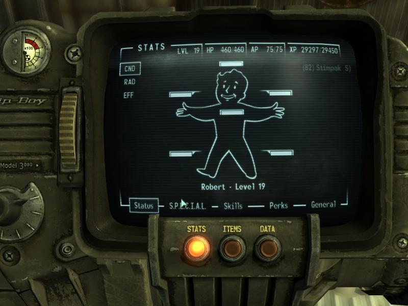
When I look at Fallout 3, it strikes me as genius how well they were able to keep the immersion with the "menu" by using the Pipboy. Not only did it perfectly fit into the storyline but it also made total sense in the context of the game. Here you are, a quaint vault dweller, and the PipBoy is given to you at age 10 like every other resident. As an NPC chides, "It'll be your best friend." It fits perfectly and is a natural way to introduce a way to get at all the information you'd need in a futuristic, post-apocalyptic RPG. Not only that, but it was also usable. A couple clicks would bring you to the maps, one more, equipment, etc. It is the perfect example of an immersive, usable game UI.
I can't recall a fantasy RPG that was successfully able to use an immersive, believable, and usable menu system like Fallout 3. Fable III tried hard to break the bonds of windows and menus by letting you transport to a "safe house" of sorts. I guess that's close to what I'm talking about and it was serviceable; I was able to play the game to completion without pulling most of my hair out, but it was still cumbersome to be transported to a "virtual menu system" and go around to find and do things like check the map, equip weapons, etc. It fit the bill of being believable and not pulling you out of the game but I would argue it was not efficient in terms of getting things done quickly. It also got old hearing John Cleese say the same quip every time you needed to check your map.
So, this leaves me wondering: how can a fantasy RPG like Elder Scrolls achieve a similar immersive menu UI like Fallout 3 that is believeable, efficient, and immersive? Here are some of my thoughts.
Managing Skills
In an RPG, you typically play a lonesome hero or hero leader that has a set of skills and powers they can use. Some are passive (as in Elder Scrolls) and others can be used like items (Titan Quest, Diablo, MMOs, etc.).
In most games, viewing your skills usually involves opening a dialog with a large tree of skills where you can invest points in acquiring or leveling up skills. There are many variations on this core design.
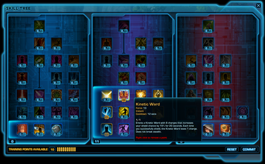
In Fallout, when you level up you're presented with a dialog where you can pick your "perk" and invest skill points. Here, the game diverges from an immersive UI and falls back on a regular dialog box UI. As a player, this never bothered me and I think is a good example of where a choice was made to use a familiar UI that, while immersion-breaking, made it easy to use.
In Skyrim, I think they did a good job making this experience immersive and fitting it into the world story. Instead of opening a special menu, your character "looks to the heavens". There, you can view constellations that correspond to specific skill trees. When you view a constellation, you can see each star, which is associated with a skill. It's exactly what I'm getting at: believable, immersive, and usable.
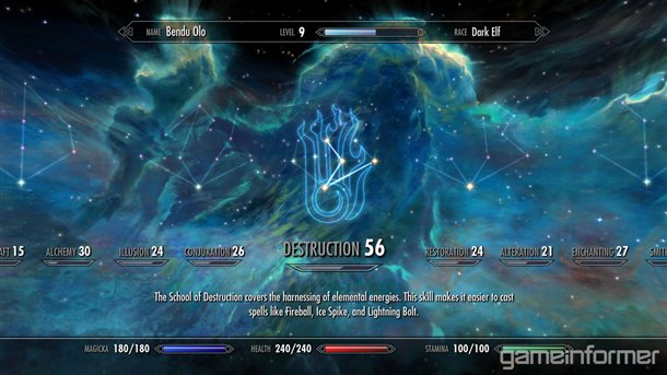
As far as leveling up in Skyrim, I don't think we've seen what that looks like. I'd imagine something similar will happen where you can "look to the sky" and there you'll be presented with some choices of what to do.
Managing Inventory
In Harry Potter, the inventory question has already been solved. If you've read the books or seen the movies, you know Hermione carries around a bottomless purse which contains everything she needs, from textbooks to tents. It's believable in a magic world, so why shouldn't a game like Elder Scrolls implement something similar?
I would imagine an animation where your character pulls out a sack from his waist and peers down into it after which you're presented with some sort of UI. Here, you could present a regular table/list-based UI or even 3D visuals of your items.
Magic & Spells
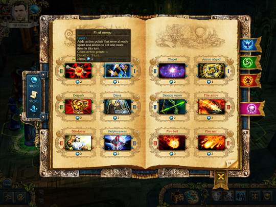
What immediately jumps to mind is a spellbook your character carries around. You could base the UI off of an open spellbook interface. Many other games do this to good effect. This example is from King's Bounty (which I haven't played so I can't speak to its usability):
Quests
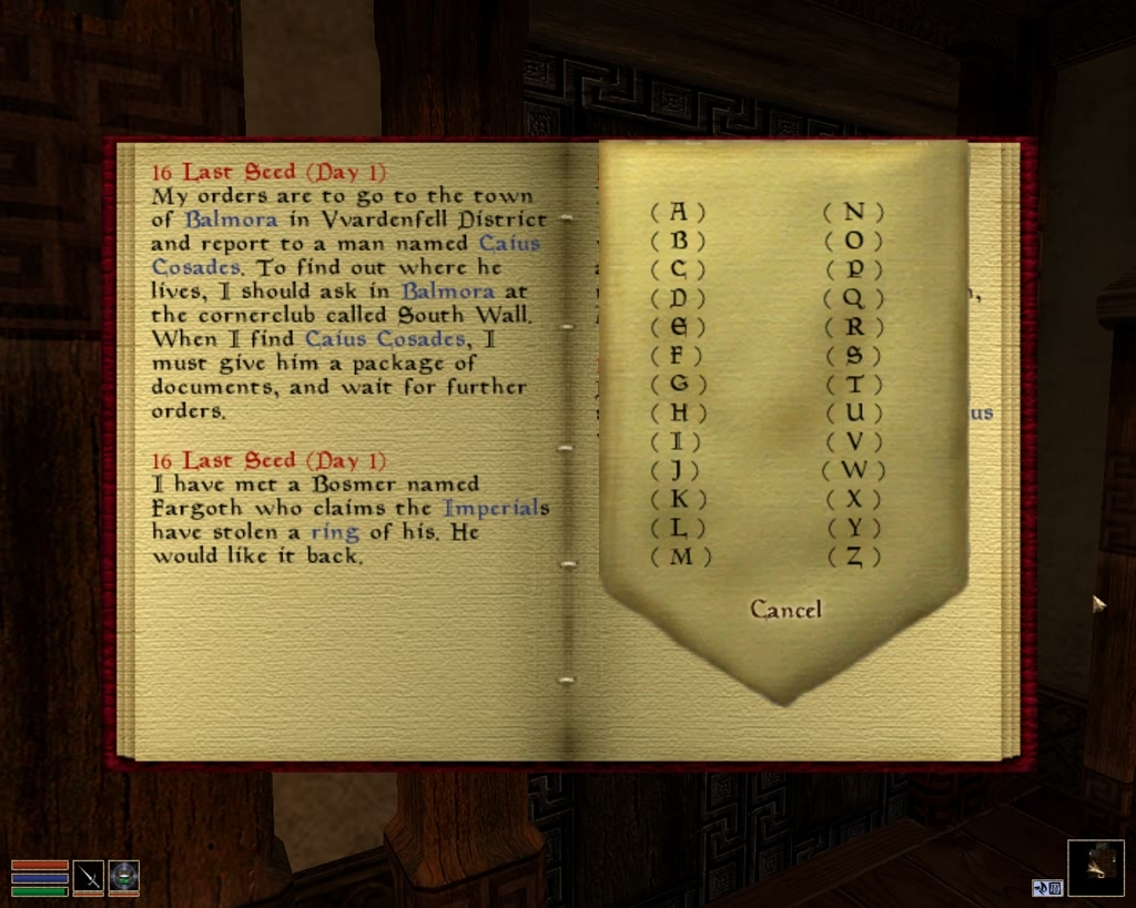
In The Elder Scrolls III: Morrowind, your quests and conversations were recorded in a Journal. While it was sometimes difficult to use, it is still a great idea and other games have played off a quest journal type interface.
In Skyrim, I do not think we've seen how quests are managed. Interestingly, I did notice that once your character reached a certain point in the cave in one of the recent demos, a message displayed saying, "Quest Started: xxx" telling me that either you overheard a new quest or an active quest can be triggered by going to some special area. You can also cast a spell called "Clairvoyant" to do a Fable-style glowing trail to your closest objective.
Map
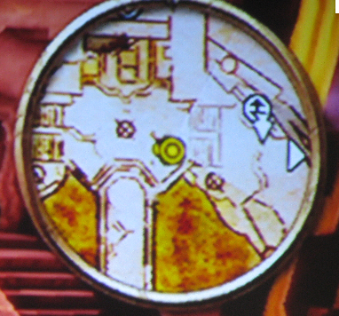
In many RPGs with HUDs, a mini-map is displayed in the corner. In Bethesda RPGs, you've always had to enter a menu to pull up a map (world or local). In Skyrim they've focused on using as little screen real estate as possible for the HUD which is awesome and in Bethesda's games I haven't ever really felt the need for a minimap (personally) although I liked how in Morrowind you could choose to have one if you wanted.
In Skyrim, when you open the map, the camera quickly zooms out and gives you a bird's eye view of the landscape, in fully rendered 3D. It's quite a sight. The only thing that stops it from meeting all of our criteria is that it isn't believable (How can you see that far? Are you a bird? Did you cast a spell? Are you God?).
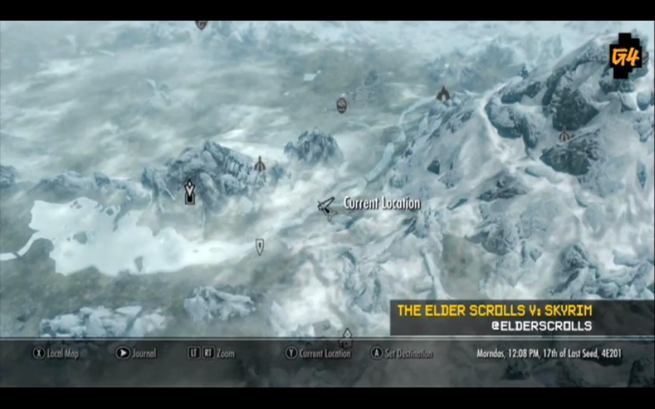
Since this a fantasy land and as an adventurer you'd probably carry around a map, we could merge the idea of a "crystal ball" with a paper/cloth map. Your character would pull out a small snowglobe-sized object and peer into it, revealing the 3D world map just as Skyrim has it implemented now. Any sort of animation involving a map or compass or globe would be a perfect combination to the new world map feature.
Favorites & Bookmarking
In action-oriented or item-oriented RPGs, typically you can assign items to hotkeys. In Fallout 3, you could assign guns and items to numbered slots on the keyboard.

In Skyrim, it appears it is more "bookmark"-based which I think is an interesting idea pulled from our daily lives: browsing the Internet. When you think about it, it makes total sense to implement a bookmark system in an RPG that can contain thousands of items.
The only issue is that this doesn't really fit into the story at all; it's there purely for organizational purposes. This is exactly the kind of place where a discussion of immersion vs. usability comes into play. You could provide the context of a "belt" and that in your belt you can take out an item in your inventory and place it there for easy access (hotkeys/shortcuts). Assuming your belt was a magical belt, it could "favorite" any number of items.
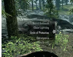
In Skyrim, there is a single favorites menu and you equip the item in your left/right hand depending on which trigger you pull, as far as I've seen. At least one preview noted that the favorites system was "slightly clunky".
You could also just argue that your character is "summoning" an item from his inventory; perhaps the cue for this needs only to be a simple sound effect or animation that plays when you hit a hotkey or choose an item. If I had the ability to use magic, it would make sense that I'd probably "tag" items in my bag to be available for summoning at will (or take the Harry Potter approach and say a simple spell, "Accio Sword of Monster Slaying").
I am not sure what the best approach here is; but what is important to remember is that this feature is crucial to keeping players immersed and outside of menus, so whether it is immersive or not, it should be easy to use.
Looting
Every open-world RPG I've played has resorted to a dialog system for one of its core systems: looting.
If you think about how a loot system works in terms of development, it makes sense. An object can hold either a set or random assortment of items, maybe placed on entering a dungeon or when the game starts. The easiest and most straight-forward way is to present a list of the items to the player in a popup dialog box.
As a player, I've always been mostly satisfied with looting UI except when a game takes away the single most important shortcut of all: Take All.
Sometimes, even as a player, you don't know you want a feature until another game implements it, which is why I'm fairly excited to see Kingdoms of Amalur implements a "junk" system where you can mark items as junk and sell them in one button press to merchants.
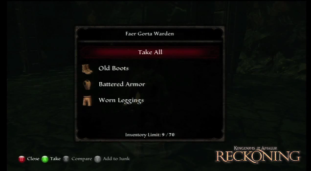
I always thought it would be neat to have an animation where you literally look inside the object you're looting (except maybe bodies). You open a chest, you look in, then a UI that looks like the inside of a chest shows up and you see 3D models of whatever is in it. Then you can "take all" or click/select the items you want. This would work great for chests, barrels, boxes, closets, etc. Not only would this not break the immersion but it would force much more realistic contents for containers. For bodies, something similar to LA Noire where you literally examine the body would be cool but also not very useful for looting quick (thus the immediate 'Take All' button). For a body, I'd even be happy with a view of the body with a list of the items found on the side. Then when you hover over each item, the camera could focus on where on the body it's located. It doesn't have to, if it doesn't make sense (people holding unusually large/small items?).
Here's a crappy wireframe of what I'm talking about:
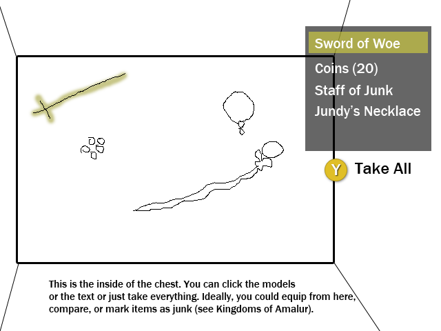
It always struck me as odd how Elder Scrolls, where every item has a 3D world model, couldn't do this. If you already have a model for every item, why not be creative in how you do looting? Some top-down RPGs like Diablo will let loot fall out of corpses and containers onto the ground; these games had it right and used immersive loot systems. Why couldn't open-world sandbox RPGs do the same, especially when items are already strewn about the world free for immediate pick up. The only RPG with a robust loot system I can think of that used in-game objects for containers was Borderlands where loot would magically pop out of lockers, rock piles or corpses but then again, Borderlands didn't have the same item scope as Elder Scrolls. Still, it's a place to start, isn't it?
At any rate, I think there's more that can be done in RPGs to achieve a more immersive loot UI. I'm positive there's a lot of fun things game designers can do nowadays.
Buying/Selling
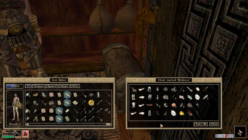
Buying and selling items in RPGs has always been a dialog-based system, as far as I'm aware. I understand why it's always been a de-facto standard that merchants carry every item they own (programming, code maintenance, item lists, etc.). The weird thing (for Bethesda games in particular) is why can't I buy things I see in a store? In Morrowind, a shop owner would have items strewn around the store that you could steal but never buy. It never made sense. I also don't think items disappeared when you bought them (they might have been tied to chests or the NPC themselves). Thus, there seemed to be a disconnect between what the merchant had on them and the items visible in the store. In Fallout, it made a little more sense that traveling traders carried their stock on their pack Brahmin (mules). I could see using a UI for that.
An interactive in-world store-front would be an awesome idea and it's not new. In Zelda games, you could go to a trader and see 3D models of items you could buy. In this context, that approach probably isn't good for RPGs that deal with dozens of items per merchant but the idea is what is important (seeing and picking items in a store).
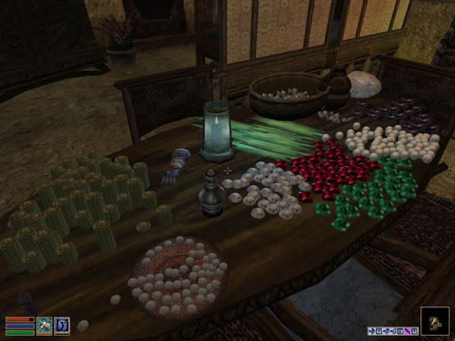
For an open-world sandbox like Skyrim, you could simply just have the items in a store on shelves like a normal real-life store. It's not like it hasn't been possible in the past... Morrowind (above) and Oblivion both had items in the store, but like I said, you could never pick one and buy it, only steal it. Make sense? Not really. You could just extend that same design but make all items available in the store marked as "tradable" so you could exchange an item on the spot or buy a new item. Perhaps implement some customer service AI and have the storekeeper follow you or check on you, allowing faster access to talking to him and selling items. This would throw a wrench into stealthy stealing, though, so maybe don't do this (Oblivion shop owners who followed me around made me angry when I tried to break into their store/bedrooms, even though at first it was "kind of cool").
This immersive storefront experience would not replace the existing efficiency (or proposed efficiency) of current designs of talking to merchants and entering a trade UI. For people that need to just get in and get out, every store could post a piece of paper tacked onto the door or counter that lists everything they sell. This would be the typical buy/sell UI. For selling, you'd talk to the merchant, tell him you want to sell, and enter this familiar UI, but at least it would be explained in the world.
The most recent game I played that used a believable immersive trading UI is Deus Ex: Human Revolution:
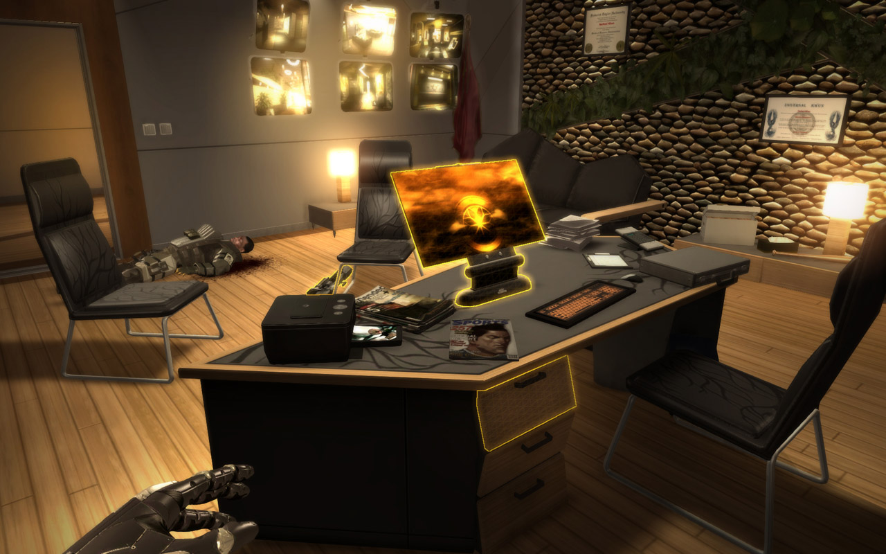
Merchants would be standing next to a computer. You talk to the merchant and he directs you to the monitor where you use a faux-OS UI to buy and sell. It was immersive, believable (except you had no idea where the items were stored), and usable (there were some quirks like not being able to use the WASD keys to navigate). In a fantasy game, that computer is probably a (magical?) piece of paper. Maybe there's something even more magical/fantastical that would make better sense.
At the least, Bethesda, do what you're doing right now, just let me buy items in the world too instead of only allowing me to steal them. You're going to let me buy the item when I talk to a merchant, why make me go through that UI navigation process if I am literally staring at the item I want? Yes, there are people that buy things rather than steal them every time. Yes, there are people would swear they've never bought an honest item in their adventure. Cater to both audiences equally efficiently.
Note: Since Skyrim is yet to be released, I have not seen or heard how merchants work in the game. Perhaps they've already done this! I'm referencing Oblivion and Morrowind where the technology was there, just not implemented.
Talking to people
Dialog is always hard because you need to offer the player a list of responses or topics. I think what they are doing in Skyrim is pretty streamlined and concise, not forcing you to listen but showing topics on the side, out of the way. I can't think of a fully-immersive way of presenting textual choices, it seems like it'll break the immersion every time but at least Skyrim is less intrusive than Oblivion/Morrowind/Fallout.
As a player, conversation systems have never bothered me much and actually, Dragon Age: Origins and Mass Effect (i.e. Bioware RPGs) have always felt like the best systems I've used as they are cinematic, enjoyable, and felt like they belonged there.
In terms of usability, the best feature I've seen is in Bioware conversations: they will show (in text) the last thing someone said to you. This is so important I can't even properly express it. It reminds me of what David Sirlin talks about in his piece of about save systems in games:
"Games are not for game designers and their ivory-tower ideals--games are for players. Players have lives outside of our games and we should respect those lives and design our games accordingly, rather than expect our players to design their lives around us." - David Sirlin
I liked this quote because I keep it in mind even when I suggest outlandish ideas like a virtual storefront. In the end, players just want to easily get things done.
Other UX considerations
Timing and animations
I should clarify: when I talk about animations (for inventory or maps or whatever) I am talking about animations 1-3 seconds long. Anything longer and you're going to run into "OMG JUST LET ME DO THIS QUICK" territory and then your beautiful menu system is going to seem clunky and slow (coughFableIIIcough). The Fallout 3 Pipboy animation was perfect: it was fast, you could follow it, you knew what just happened, and it made sense. We live in a world where web pages need to come up in less than 100ms and we can't wait those extra 5 seconds for our download to finish. Keep it short, simple, and believable. You could also use animations to mask processing time; if it takes 100-300ms to load up a player's inventory, an animation would hide that CPU time. I've never programmed a game in my life but on the web, for AJAX requests showing the loading animation even for quick calls is crucial for immediate feedback.
Timing should be one of--if not the--highest priorities when designing a usable menu system. Ultimately, people want to get things done in your game. That's why you saw me say again and again for storefronts, let power users use the inventory list to buy/sell quickly. It doesn't have to be totally immersion-breaking. For those of us who sometimes enjoy strolling through a vendor's inventory visually, we can do that. Efficiency is the name of the game (that's why God invented the Take All command).
I don't think timing and immersive UI are mutually exclusive. Pipboy is my case in point. Borderlands looting is another case. Game designers are by their nature creative people. Use that creativity to prove that you can make an immersive UI without sacrificing efficiency.
Providing critical information at a glance
One thing I noticed about the menu system in Skyrim that I'm not super-enthused about is the lack of critical information without "hovering" or selecting an item (as seen here):
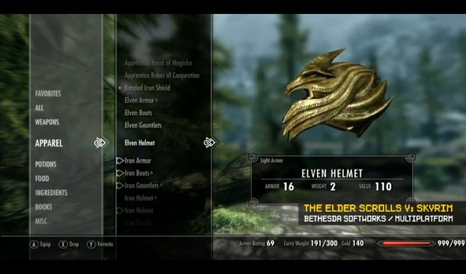
One thing I liked about Oblivion was that they showed some critical information in a table format... so I could sort by damage or weight or see at a glance what the armor rating was for items I held. In Morrowind, you had to do a similar hovering to see stats.
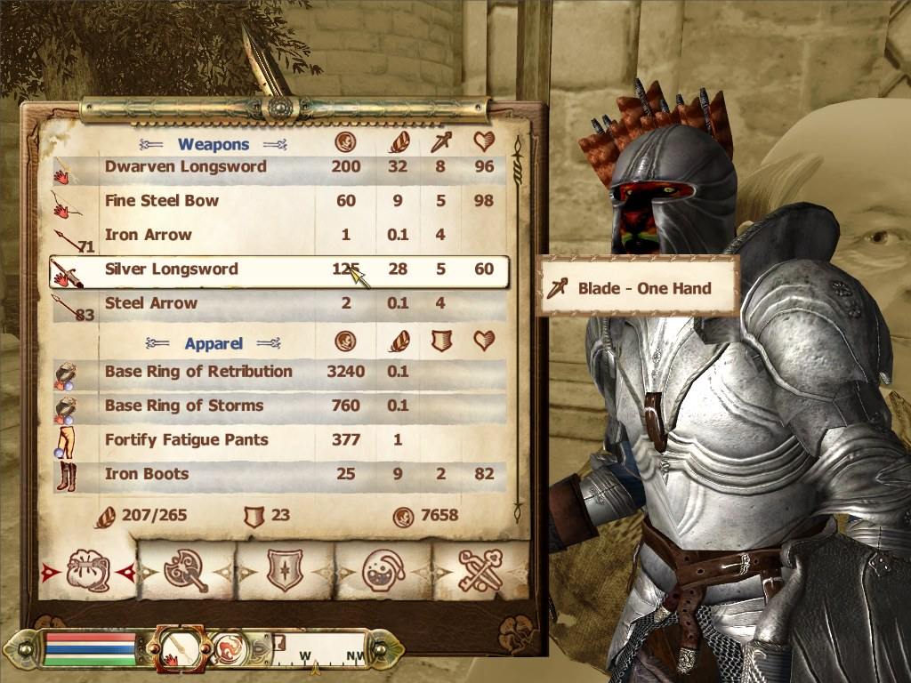
I could see the UI discussion both ways. When I want to equip an item, I don't care about all that other information. However, when I want to sell an item or see if the new item I picked up is any good, I do care about that information. The lack of information in the new UI is both a good thing (clean) and bad thing (lack of information at a glance). I don't know what to think of it yet as I haven't used it but it could turn out OK given some tools to effectively manage my inventory. I'd also like to believe that the console UI is simpler than the usually-more-heavy PC UI.
Providing quick comparisons
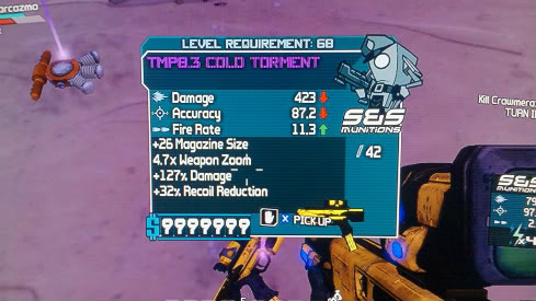
The other thing I didn't see (I think) was a quick compare type UI/popup. Bethesda RPGs have never done this. It boggles my mind. If I find an item in the world, I would immediately like to see if it's better than my current equipped weapons (preferably by simply hovering over it or inside of a loot UI, selecting it). If I am browsing my inventory, I'd like to see an immediate comparison to my equipped weapons. One of the best games that did this was Borderlands and is how I'd love to see it in an Elder Scrolls game; as soon as you found an item it was easily apparent what was better/worse about it:
Remote trading
I don't know if this is a good idea. But... stay with me. In Torchlight, while you are out adventuring, you can send your pet (who doubles as a pack mule) back to town to sell whatever he's carrying. No bartering, no nonsense, he comes back in a certain time depending on how much you sold. It's genius, I think. How many times have you been stuck in a dungeon, with a fricking sweet axe in front of you, put it in your inventory and... now you can't move (or in newer Bethesda games, move at 1in/hr). The very dedicated among us might endure the 5 mile long walk moving at the speed of a snail but why should we? In Torchlight you had a pet with a backpack. It totally makes sense to say to Rufus, "Hey boy, take my crap back so I can carry more. There's a good dog." In a lone-wolf type game like Elder Scrolls it might make more sense to magically send items to a merchant or... just open a portal. Hey, you could teleport in Morrowind, it's not a new idea. In Diablo/Torchlight you can open a town portal. That solves the issue, albeit you still have to walk to the merchant, enter the UI, trade, etc. Extend that a bit and you have the ability to remotely buy (or simply sell) items on the spot. Game balance, difficulty, etc. should all be considered in a feature like this but Oh God Wouldn't This Be Useful?
I could see some arguments saying that this would make inventory management too easy. Maybe... but isn't that what you want? You can't tell me you haven't cursed the weight system in Elder Scrolls. I hate to break it to you but now that we've got fast travel, what's a little town portal added to the mix? In Morrowind, one of the first things I do is enchant two amulets: one with Divine Intervention and one with Almsivi Intervention. I pay cash monies to do it straight away because it makes my life so much easier. I can teleport pretty close to town no matter where I am.
Anyway, I doubt you'd use this system to just sell your awesome items all the time... you probably want to hang them up in your modded Dracula castle display cases (like me). You probably don't need all those shiny treasures you're carrying, taking up precious space, that you're just going to sell for cash. You want to carry good stuff that you need for a quest or side project (crafting?). I think this would just make it easier to get rid of stuff you don't need fast and easy.
With new systems like fast travel, this is less of an issue until you're deep inside a dungeon and forgot to empty your rucksack before your curiosity got the better of you and you just had to enter that underwater cave...
Closing thoughts
I'm not saying Skyrim's UI is bad or is wrong. But as someone who continuously works on building better user experiences at work and at home, I always look at my projects and go, "Man, I could really do this and this and this to make it even easier." That's all I want to do with this--point out, as an outsider and future player--what concerns and thoughts I had regarding what I've seen so far.
I'm just wondering why designers/developers don't try harder to make their UIs more immersive and "make sense" within the context of their game. I know it's possible, I've seen it with my own two eyes. I keep referencing Fallout 3, but it's because I was amazed at how well it all just made sense. Pipboy? Sure why not! Sure, dialog/buying/selling went through typical dialog windows but at least they all matched. Even there you could do similar things to what I was saying, maybe with an interactive storefront. Borderlands is a great example of immersive looting, as well as many top-down RPGs.
I also want to be clear and say that while I think having an immersive UI is best, it's also important to let people just get things done. What I mean is, have the sweet & snazzy immersive visual storefront with items laying around to buy, but cater to the power users and keep the quick buy/trade UI. See Windows 8 Metro UI v. classic Windows 7 UI.
I also think you can go too far and just make things clunky and unintuitive. It's a line that's hard to see, I think, and since it's a game and a piece of software, it doesn't all have to be "realistic" and immersive. If it works and is easy to use, that's probably good enough. Going the extra mile to include visual detail is definitely a win in my book, though. What matters in the end is that the player is happy to use your menu system and doesn't curse it until the day they die.
I'm interested in hearing other people's suggestions; after all, we're the ones that play the games to death. I'm just really surprised Bethesda went with a sort of "contemporary" (Apple-like) UI rather than an immersive one like F3 or even a stylized one found in Blizzard games. It's also important to remember that what we've seen so far of Skyrim has been on 360 not on PC and Bethesda could have done UX optimizations for the mouse rather than the controller-oriented design we've seen so far.
