Experiences In the Wild: Away Signs and Picture Frames
Inspired by a lot of the research and learning lately I've been doing around experience design (which has always been a passion for me), I decided it might be fun to start sharing the little things I run into in daily life that frustrate me as a user or that give me some joy.
The big catalyst for deciding to do this was Aral Balkan's amazing keynote at the Norwegian Developer Conference 2012 in Oslo, Norway:
NDC2012 - Opening and Keynote "A happy grain of sand" by Aral Balkan from NDCOslo on Vimeo.
If you haven't seen it, you must watch it now if you do any development or design. It may just change how you think about what you do.
I may or may not commit to doing these kinds of posts each week, but I will try! Since Google+ instantly uploads my camera photos from my phone to my profile, I don't have much of an excuse not to share my feelings.
The last thing I want to say is that I want to approach this from the standpoint of a user, myself and how I felt. When something is frustrating, we like to blame ourselves. The fact is that in the majority (all?) cases, there's an aspect of bad design at work. When something makes us happy, we should take note of what it was that caused it!
I'd highly recommend reading The Design of Everyday Things, as it should cause you to take a deeper look at the things you use every day and question whether or not they show aspects of good or bad design.
The Away Sign
I went to work today to pick up some prints I requested (I will talk about the job request form in another post!). When I approached the print desk I was greeted with this:
First off, this is better than nothing! At least I know that from the time I see this sign to 5 minutes from now, they should be back. This made me feel good.
What I want to point out is that there's an even better option.
When I went shopping for a new place to live, we visited a ton of leasing offices. Rental agents have to give tours of the model or vacant apartments every day practically. It makes sense they should give feedback to people who arrive early to their appointments.
Can you guess what they did?

(Source: LittleClockShop)
Yes! That makes me happy! Not only do I know the folks are away, I know when to expect their return so I can plan accordingly: Do I wait in the car? Do I leave a message? Do I simply wait?
The problem with saying "Be back in 5 minutes" is that when a customer arrives, they don't know what 5 minutes means. The 5 minutes was relative to when you posted the sign, not relative to when a customer arrives. It's OK to not know the exact time you'll be back, but it's still better than a relative time.
The IKEA Picture Frame
I love IKEA. I understand that I will probably need to replace a lot of the things I buy from them in a year or two, but I like their philosophy.
I usually have no frustrating experiences with IKEA, even with their absurdly large warehouse store.
Today, however, was different. I needed to purchase low-cost 8.5x11" frames for a project I'm doing. IKEA to the rescue! I found this great NYTTJIA frame for a measly $2:

Excellent. I headed over to my local IKEA store, ran in, and ran out with 8 of them.
Looks fine to me! Fast forward to when I arrived home and decided to put my pictures in the frames. The frames are wrapped in plastic, so I tore them off easily. I opened up the back of the frame, cool, this is easy. I get down to the included backing paper and take it out to reveal the laminate cover.
Then, what I saw made me get angry.
The plastic cover has stupid recycling symbols on it, rendering it completely useless for covering and protecting my photos.
Let's take a closer look, shall we?
What. The. Hell.
Why would you do this IKEA? WHY? I understand I paid $2 cheap dollars for this, but why render the plastic covering totally useless? I don't understand... am I supposed to assume I needed to buy coverings separately?
You totally didn't make it seem that way:
Front protection in durable plastic; makes the frame safer to use.
NO! NO IT DOES NOT! I can't use it! I would get stupid little symbols over my photo.
Wait a second...
When I originally wrote this post 5 minutes ago, I posted the story above. After re-reading it, a sudden thought occurred to me!
What if it's just a thin covering?
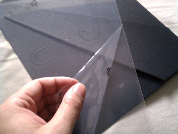
Well, what have we here!

So it turns out my rage against this frame was misplaced. It turns out, IKEA did do something right: they protected their protective cover.
But now I want to talk about why this design sucks.
My Mental Model
So why would I make this mistake? Why didn't I realize that the symbols I saw when I bought the frame were on the plastic and not on the paper? Why didn't I realize right away it was only a thin covering I could peel off?
- In the store, I unconsciously assumed the symbols were on the paper, not the plastic
- At home, I unconsciously assumed the symbols were printed on the plastic
My mental model was based on past experiences with picture frames, all of which had included a plastic or glass cover that had no marks or symbols on them. There was no reason to suspect this frame would be any different.
The issue was that IKEA took it one step further, becoming clever. That cleverness translated into frustration for me when I didn't see the cleverness right away.
Now that we know what the problem was, is there a solution? I think so, it's called a hint! I think the standard term for this is an affordance:

Source: http://wpcornerpeelplugin.com/html/
That is essentially all IKEA needed to do to prevent this problem. By folding a corner, providing a colored peel tab, or using any other myriad of techniques we see every day, they could have avoided my frustration and automatic assumption that they hated me.
So there you have it
One fairly pleasing experience, one frustrating experience and that was just this morning. Oh what fun me and you will have in the coming days! I will try to keep it balanced in each post, showcasing something that made me happy and something that did not.
If you came across something that made you happy or frustrated today, share it!
