5 Things I Learned About Design While Living Abroad for 6 Months
My wife and I have been living abroad in France for the past six months, since December. We had originally planned for me to work during this time (and to stay longer) but sometimes things just don't work out as planned. Still, it was truly a blessing in disguise as we've been able to travel and I've been able to observe and learn about how people around the world use technology that has affected the way I think about how I design software and websites.
Here are 5 things I've learned during my 6 months living abroad.
1. Mobile is well and truly ubiquitous
We know phones are ubiquitous, right? But I don't think I truly understood until I traveled around and saw it for myself in "the wild." When you travel you're reduced to the bare minimum you're willing to take and a phone is a lifeline. When you're trying to pay bills, send PDFs, or figuring out bus routes, you start to appreciate all the connectivity you really have.
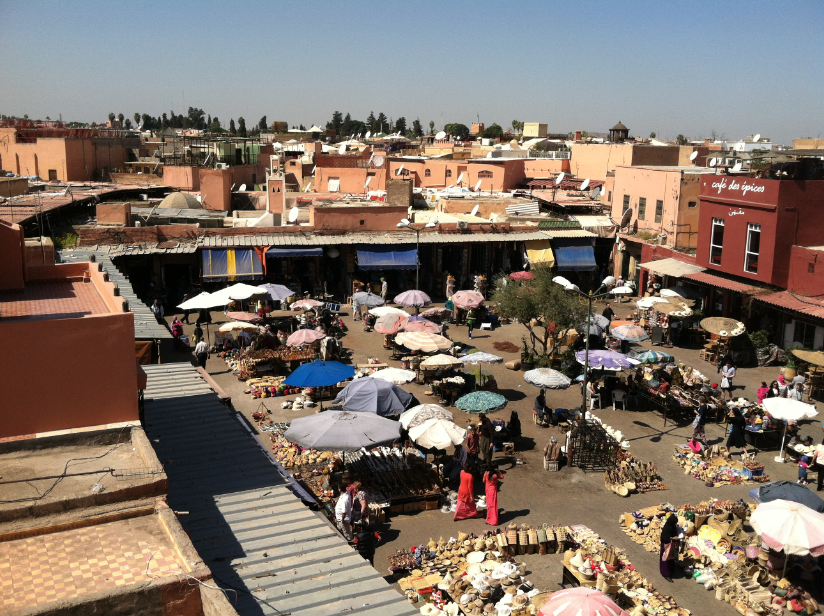
When we walked through the Cyber Park in Marrakech, Morocco, we saw people from all walks of life gathering and sitting around the park. Were they frolicking through the gardens? No, although the gardens were beautiful. The Cyber Park in Marrakech is actually a fully connected park and offers free Wi-Fi for anyone that wants to connect. They even have touch kiosks with Chrome installed on them. This was important to us as our Airbnb internet was actually powered by someone's 3G data plan. It was slow as heck. The park's Wi-Fi was pretty decent, good enough to do a video call and more than enough to browse news or check emails. This was a cool idea merging beautiful outdoor environments with technology. United States, let's see some cyber parks!

I watched as pre-teens and adults took their phones out (usually Android) to text or surf the web. Not only were they using "low-end" hardware they were trying to use apps and sites we build. Can your site even run on a low-end Android phone? Can mine?! It was an eye-opener. As the community flocks to all-Javascript, all-the-time frameworks like Angular, I sat there wondering if that's really a good idea if you really want to reach people, everyday people, on all these devices.
Even in a modern city like the one in France where we lived, Internet connectivity is available but not optimal. The fastest we can get in the city center is 15Mbps, which is pretty good but nothing like the 40-100Mbps I can get in Minneapolis. Mobile is a bit better, with access to LTE and 4G for most subscribers on the major networks--I myself used SFR "La Carte" with 1GB of data for 30 euros per 30-day period. I ended up just switching to the 600MB option for 20 euros since I didn't actually use all that data. Data caps are a thing, folks! Thankfully native apps provide options to prevent them from hogging data on cellular networks but web sites? Nope--so I avoided surfing the web when on data.
People are using their phones everywhere, way more than they are using laptops (if they even own one). People don't sit outside here on their MacBooks. They browse and consume on their tiny little phones. Teens sit on the stairs of a building in the historic city center of Marseille, their thumbs dancing across the screen of WhatsApp sending emotes to their friends. Adults sit at a cafe, sipping espresso on the canal streets of Amsterdam as they type on their iPad. Commuters stand in the Paris metro, headphones plugged-in playing Candy Crush Saga on their Windows Phones. Business people in suits walk briskly through the streets of central London, phone in hand checking their emails. Merchants in the souks of Marrakech discuss politics over some mint tea while checking Twitter or the news on their phone. Your driver is chatting with his friend in Arabic as you head 200km through the countryside to a village in Morocco. This isn't made up, these are all things I've observed first-hand.
The truth is, when we design, we typically design for ourselves, in a bubble. I think we're all guilty of it. It's not until you're out there, "amongst the people", that you realize that maybe testing your site on the high-end phones and super-fast LAN networks might not be representative of the people using your site. I brought my brother's laptop with me and it really sucks for development. It's slow. Still, it's kind of a good thing, the pain I feel while developing forces me to live through every slow cycle the CPU churns out as Visual Studio pauses between keystrokes, or Chrome chugging on [my] poorly written Javascript. Performance matters but We are Designers and we work on big rigs so we don't feel that pain as much as we should.
I challenge you to pull out that dusty Dell laptop from 2004 or your 1st-gen iPad and try running your site. If it works, you might be reaching way more people across the world than you thought. If it doesn't... well, it's up to you to decide. From the souks of Marrakech to the canal streets of Amsterdam, it's all the same: Mobile. Is. Ubiquitous. And it is used everywhere in every setting imaginable.
2. You can learn about design from transportation networks
If you want to learn about designing for everyone, you can't do much better than being a tourist and navigating the transportation networks of the world. The variance between cities is astounding.
Amsterdam
Amsterdam has fantastic real-time traffic data for buses, trams, and trains. This data is not only available on Google Maps but is also shown live on the buses and trams, making it crazy easy to get around. Their tram system also has an electronic check-in/out system where you check in as you walk into the tram and check out as you go out. This sounds good in writing but in practice it is confusing to tourists (or non-Amsterdam natives) as only certain doors can be used to exit. Clearly the designers wanted to help expedite the boarding/off-boarding process but it also makes it very confusing for first-time users expecting to get on and off through the same doors. Furthermore, there are constant reminders to check in and out because if you forget to check in, you'll be fined, or if you check out without checking in, the next check-in will cost a lot more than you anticipated since it calculates fare from check in to check out.
Oslo
The Oslo T-Bane is well-designed for the Norwegians who love to ski and do activities. The metro cars are super-wide with plenty of leg/aisle space for skis and equipment. It even goes straight from the city center up into the forest to the ski area. We saw people literally skiing out the doors of the metro into the snow-covered forest.
London
The London Underground offers the easy-to-use Oyster card for checking in and out with pay-as-you-go discounts; it's accessible to tourists moreso than typical travel cards. Instead of the paper ticketing system, you just tap your card on the reader at the entrances and exits of the station. The route maps and overhead signage are also super clear about cardinal direction and major stops along a route. In the Victoria station (and elsewhere), lines run across the floor indicating the path to specific areas of the station (Tube, Gatwick Express, etc.).
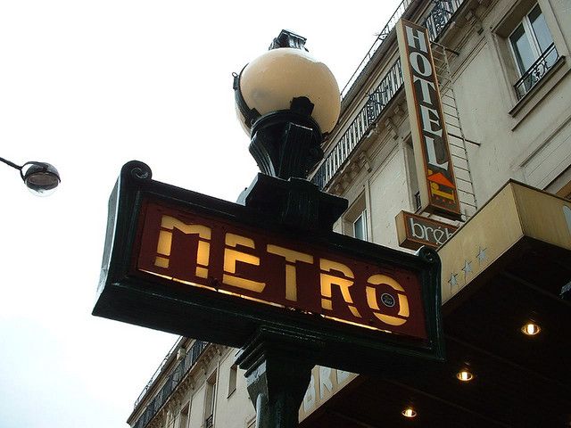
Paris
The Paris metro is easy to navigate but not as easy as the London Underground. Unlike the LU, the Paris metro does not have cardinal directions or major stops in the overhead signage, so you need to inspect the route map closely if you can't remember the terminus you need.

Another difference is the ticketing. Most people use paper tickets, many of whose remains can be seen thrown on the ground and littered across the metro. Not only is the Oyster card more convenient, it's also friendlier to the environment.
There were some things I thought were better designed over the Underground.
One was that the outdoor signs for the Paris metro are easier to see. The Underground signs in London are flat when viewed from the side (so they don't stand out) but the Paris ones have a crazy looking gothic style, making them easier to see through the hustle and bustle of traffic and pedestrians. The Paris metro stops are also easier to stumble across because they go directly down into the ground versus London where station doors are on buildings. Furthermore, the Paris entrances are on both sides of the street whereas the Underground only has specific exits. Sometimes it depends on the stop but in most cases these hold true.
Another thing I liked was that the Paris metro has exit maps that show the local street map with the exits marked clearly so you can orient yourself as soon as you leave the train car. I did not use the Underground enough to see if they offered the same maps but we found the exits easy enough since they listed the attractions.
One more positive the Metro has is the exit signs are green with a little person running to the door. The Underground exit signs just say "Way Out ->" without any iconography. Even if you don't know French, a bright green exit sign with the image of a human running to a door is fairly clear, but if you don't know English would you understand the Underground signs?
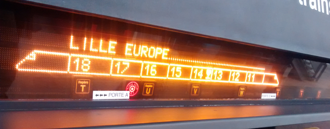
Trains
Train travel is common in Europe and is operated primarily by SNCF in France. The train stations themselves are designed well, including one feature that was very notable: the presence of a piano. I mean it, every station we've been in has featured a piano that anyone can play. I'm not sure how that would go down in the US, but in France it appeared that only people who knew how to play piano used it and there's just something about waiting at the train station listening to the overture of Pirates of the Carribean or the thumping Game of Thrones theme that puts a smile on your face in a boring or stressful situation. The stations are well-designed to boot, with train diagrams indicating the coach numbers and platform.
3. Designing for tourists is a lesson in tutorials and accessibility
Did you ever stop to think that when you're a tourist, your experience is really designed by the city? Some cities do it well, others do it poorly or not at all. As soon as you arrive in a new city, you might be equipped with a LonelyPlanet guide but that's not enough to prepare you directly for what you experience. Even with a hefty amount of tips from us, our friends still were confused about the differences between the RER A, RER B, and Metro systems in Paris (not to mention the whole Zones 1-5 thing).
Nantes, France
One of the best examples of good tourism design I encountered was in Nantes, France. First, the tram stop is clearly marked and visible from the exit of the train station--this is not always the case everywhere. Second, throughout the entire city is a green painted line on the pavement, on the sidewalk, on the roads, everywhere. If you follow this line, you will be led to most, if not all, of the common tourist stops in Nantes. GENIUS. If you were lost, follow the green line back to a landmark. I can't imagine who convinced the city to do this but they should be applauded. Can you imagine someone suggesting painting a green line in NYC? Imagine the red (green?) tape you'd wade through.
Along the route of the green line, there turned out to be another set of surprises. Do you recognize this character?
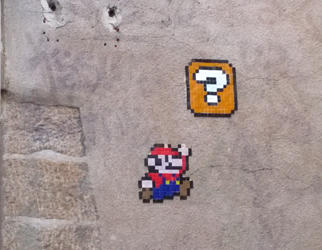
Him and his ilk were peppered throughout the city on the sides of buildings along the route of the green line turning our walks into a sort of scavenger hunt. So not only was the green line helpful, it made me want to follow it by discovering all the videogame characters--it was fun. In the end, I found about 10. I have no idea if the characters were intentionally put there by the city but whoever did it was a genius because it made me want to explore the city (and we did). I had to collect them all!
The other excellent piece of design we found in Nantes was this free eating guide, shown below.
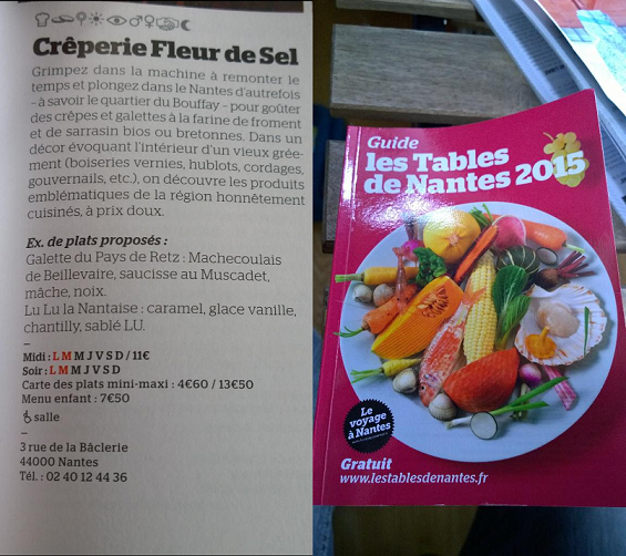
This was a well-designed guide to all the restaurants and cafes in Nantes. Unlike many other sources, including Foursquare and TripAdvisor, they provided the schedule of the restaurant along with a min/max dish price. It was fantastic for planning on where to go; it was like doing an Advanced Search in a book ("OK, what has a price below 15 euros but is also an Editor's Choice and open on Mondays?"), you could easily scan the book to answer that question. By the way, the answer is Shalimar, a fantastic Indian/Pakistani bistro where I had superb beef madras.
Nobody is perfect though. The tram system in Nantes was super confusing at first because the kiosks did not explain the difference between the 2-3 types of network tickets you could get ("Which one is the TRAM ticket, damn it?!"). Instead it only had the name of the network (which did not include the words "tram" or "lightrail" or anything indicative of what kind of transport it was). Eventually we saw the network's logo on the tram and bought a ticket for that network (it's Tan, if you were wondering).
Oslo's UseIt
Oslo was another example of some great tourism design. Oslo is known for being one of the most expensive cities in the world and our experience backed that up (one small Chipotle-sized taco for $8, uhhhhh). So our primary motivation when visiting Oslo was to spend as little money as possible. Well, a local company called UseIt sources advice and tips from locals to provide a super handy guide to the city including things to do, cheap eats, and really cool walks (like the Art Walk) along with free maps. We found the guide in our Airbnb room but they had an office in the city center near the tourism office. They even let you store your luggage there and use the free Internet--two things that travelers might desperately need in an emergency or unplanned event. Kudos, UseIt team!
Your app is a city
Tourism design is essentially designing a tutorial or introduction to your city for newcomers. Now think of your app as a city. We try to design for FTU (first-time users) on apps and sites but often we leave it until they actually join or use a fancy new feature. We should be providing the information they need immediately, as soon as they arrive in our beautiful city whether by car or foot ("Tourism Office ->") or by train, plane, or bus (free guides at the station!). Great tourism design gets the visitor familiar and provides the information they need to plan their visit and ideally, spend the most of their time (and money) actually doing things in your city. Sometimes visitors planned ahead, sometimes not, for others it might just be a quick stop on the way to another destination; whatever the motivation, make sure you've given some thought about it.
The introduction starts as soon as people arrive, so take a look at the entrances to your site--do they give the visitor the information they need to navigate your beautiful city? Have you explained your 3 methods of transport? Or they do they leave frustrated and discontent, ready to move to the next city on their agenda?
4. There are a lot of people in this world
This might be a no-brainer, just like saying mobile is ubiquitous. But again, has the magnitude really hit you?
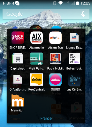
When I design I design English-first. This is all well and good for us native English speakers but when you're living in France, trying to use French-made apps like the local theater app, you curse the designer for not adding an English localization. But can you blame them?! They are just doing what we do, writing in their native tongue. It's the same everywhere. There are SO MANY local apps--there's RueCentrale for local restaurants, Cinema Aixois for local movies in Aix-en-Provence, there's Capitain Traine, Voyages SNCF, and Ouigo for planning train rides, PACA Mobilite for bus routes solely for southern France, and Marmiton, the AllRecipes of France. Apps are everywhere and you don't even know they exist until you're in the region they're used. On top of that, most of them are not localized. Just take a look at my France folder on my phone:
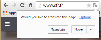
Don't even mention the SFR portal used to manage my phone and SIM, try learning simple tech terms like log in, log out, etc. in a non-native language. Thank the Lord for Google site translation.
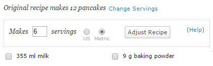
What about your apps? What about my apps? I usually don't even stop to think about how things differ between countries like dates (DD/MM/YYYY vs. MM/DD/YYYY), phone number formats (+33 01 02 03 45 06), time (24h vs. 12h format) or how an American living in France can't wrap their head around the metric system when trying to cook or bake. Kudos to AllRecipes for including an automated Metric conversion for recipes so we can use our measuring cups here.
I don't even know what libraries to use for localizing/globalizing JavaScript apps because I haven't done it! I know they exist but I haven't used any. I've done localization before in C# (once in French, even) but that's the extent of most of my experience. Why is that? For one, it's just easier to write code with strings in English. Anytime you begin to introduce other formatting and cultures, things get more hairy. It shouldn't be that way. Another reason is simply because it's easy to just assume people will speak English but this is a bad assumption. We've met a ton of French, Moroccans, and to a limited extent even Dutch who don't know any English and they're automatically excluded from using your apps simply due to their language. Even the English speak a different language than Americans. Some have jokingly commented that they can't understand us (well, I don't understand you, friends. Bobbies? Really?). We didn't get to travel to any Asian countries but I imagine it's the same everywhere or even more pronounced. Even if someone is fluent in English, we use idioms and slang they might not be familiar with. Take a second look at your copy on your apps. Would someone whose second language is English understand what you're even saying?
Living somewhere else for an extended period of time really makes you appreciate when a designer has thought about localization and globalization. We need to do better. I need to do better. The world is a big place and there are a ton of people in it--are you designing for everyone or just yourself?
5. If you have the means, see the world
Finally, get out of your comfort zone if you can. I've learned a ton just by being a visitor, a tourist, to all these locations.
Make a goal to travel someplace away from your comfortable home sweet home. Maybe it's only a week or maybe, if you can do it, save up and take a sabbatical. We are lucky that we had a chance to do this and I understand not everyone can travel, especially for such an extended amount of time. You might have children, you might be in a different phase of life, you might be falling on hard times, there could be any number of things preventing you from traveling. If you have the means, try. At the least, just get out and tour your own city and observe the people in it! You might see things differently when you're the one trying to get around or sitting at a cafe watching people use technology.
After all, what are you working for, if not to better yourself and learn--living and experiencing new things is a sure way to grow. It has affected the way I think about design and I think it's important to observe things for yourself.
Challenge yourself. I didn't think I'd be into going to Morocco but it was amazing and I'd go back again. Using GPS to navigate the labyrinth of souks while being hassled by shop owners is definitely an experience you won't get anywhere else.