
Frustration With the VS2012 Team Explorer Tool Window
I would just like to quickly comment on something I noticed while using VS2012 and Team Explorer (we use TFS at work). Below is a screenshot of the window as it stands in the RC.
Can you tell me what role the black text in the window plays?
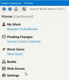
If you said "headings," I would not blame you because that's exactly what I thought at first. In fact, they are links to the common tasks you'll do in TFS. I didn't realize this until my mouse happened to hover over the tasks and then it became underlined with the pointer cursor. There's a pretty clear violation of the Gestalt principle of color here; why are some links blue and the most common ones bold and black? Unconsciously, this matches my typical assumption of headings, when in fact the true intention is to make the common tasks stand out.
We see this header/nav paradigm all over the web. Here's what Apple's footer navigation is styled like:

My automatic assumption is enforced by the fact that the Home heading is also black and bold, the only difference being the size.
This is even a paradigm within VS2012 itself. Here's an example on the start page:

Or, the Start tasks...

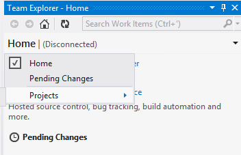
The other thing that frustrated me the first time was figuring out how to change team projects. It's not easy to figure out. You need to click the team project name, which looks like a label except for the arrow on the far right edge.
I like what the team is trying to do here, I just think the navigation needs to be gone over again to reduce the confusion.