
Some Thoughts on the VS11 Beta/RC/RTM Interface
As you may know, the next version of Visual Studio dubbed VS11 is available in Beta form right now for developers worldwide to complain about go wild and test against.
While you can learn more about what VS11 offers in terms of new features, I think the biggest thing you'll hear about is feedback regarding it's new user interface style. I want to write down some thoughts I had as a heavy Visual Studio user and self-professed user experience (UX) aficionado.
Please don't hurt me
I want to be clear that I am not here to bash on Visual Studio nor complain about the new interface. Rather, I'd like to take a constructive look at a couple of the cosmetic changes in store for us.
I HEARD U LIEK ALL CAPS
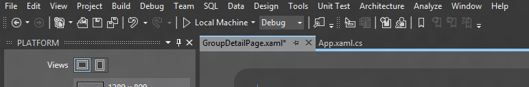
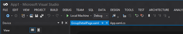
I think the biggest thing I see on the tubes these days are comments about the ALL CAPS menu change from the Beta to the RC as you can see below (this is the Dark Theme):
Beta:

RC:

What People Are Saying
Why is the main menu SHOUTING AT ME? This is terrible!
What People Are Missing
Whether or not you believe a fundamental user experience principle has been violated here, I think the underlying issue all along has been: why are there so many damn options?
All caps or not, I think the team should be aiming to reduce the amount of time I even need to look at the main menu and even better, totally eliminate or consolidate some of those menus. If I had to list what menus I used the most it would be:
- Edit - to get to some advanced options that I can't remember hotkeys for
- View - to see a window I closed at some point or find a window
- Build - to Rebuild/Clean sometimes or build my current project (vs. the entire solution)
- Tools - to get to extension manager for updates or new extensions
- File - to open a project when I'm not on the start screen
That's about it. So, in other words, I use about 5 out of the 16 total menu options regularly. Does that sound like the Pareto Principle (80/20 rule) at work here? It should at least have crossed your mind. Admittedly, this is just for me but no matter the person, I would expect to find that the typical Visual Studio user does not use all the menu options every day or very often.
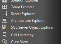
One of the nice things about VS is that you can totally customize the menu. For example, here's mine right now:

Unfortunately, I can't do much more because VS2010 crashes if I try to modify the menus themselves, otherwise I'd move Theme, Resharper, Sitecore, and Mindscape into the Tools menu reducing my total menus to only 6. Finally, I'd like the ability to hit Alt to enable the menu, otherwise it should be hidden (see Sublime Text). I don't know if there's an extension that enables that.
Just because I have the control to move my menu commands around doesn't mean it solves this problem. There are so many commands in Visual Studio the team could expose but don't simply for that reason, there's just too many. A different kind of menu should be considered that doesn't rely on the "classic" menu bar pattern.
Is it too crazy to think about a menu inside Visual Studio that acted like the Windows OS menu? It could list my most recent actions or actions I pin, it could group different tasks or let me open an advanced panel to see more tasks. The useful Ctrl-3 shortcut in one of the power tool extensions lets you start typing to search the menu system (and I believe that is what the search box in the top right of VS11 also does); why not build that into a single menu ala Windows 7 Start Menu? Dare I even mention... a ribbon (shudder)?
Monochrome is the New Color
In the VS11 beta, probably the first thing you'll notice is the distinct lack of color. Where'd all the pretty icons go?! If you asked me how I felt when I opened it up for the first time, the word "depressed" probably would make the cut. I know that sounds extreme, but when you talk about how we as humans perceive colors, certain schemes evoke certain emotions.
Again, let's take a look at the dark theme (since it exacerbates the effect):
Now, work has been done since the beta to add color back to VS which I believe makes it look so much better:
The added color in the icons really makes a difference and I was glad to see it back for the RC and RTM. I also think it's very admirable that the team will release the vector versions alongside Visual Studio for use in our own apps. In this day and age where images need to be scaled for different form factors and "Retina" displays, I think we'll be seeing more emphasis on vector-based icons. GitHub even created their own font to address the issue. You could argue they may have jumped the gun a bit but hopefully font rendering will continue to improve in modern browsers.
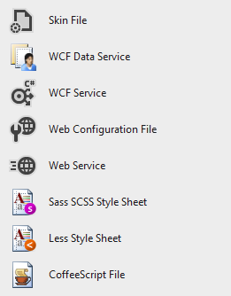
My one criticism is that not all icons will be mono'd right away, so with some extensions you'll see something like this:
I know they specifically fixed this icon in RC, but I'm sure there will be more instances of this, especially in the New File dialog:
This can be fixed by extension developers, but I hope (as an extension developer myself) that it is not too painful to provide iconography for both the VS2010 and VS11 version of an extension.
Other Thoughts
In general, I think those are the two big topics I see while reading blog posts and seeing comments. I may have other thoughts for the overall experience but I'll save them for future posts as I use VS11 more and more.
As always, let me know what you think! Do you have other criticisms of the interface? If you're going to just go on about how you hate M$ and VS11 is terrible, don't bother responding. The VS team would benefit more from constructive feedback.